

Prescription labels are often confusing. Understanding labels can be a challenge for all patients, but especially for those who have low health literacy. Patients who don’t know how to take their medications correctly can get hurt or even die. This is one patient’s story:
She took 3 times the amount of medication she was supposed to because the label confused her. The directions read, “Take 1 1/2 tablet twice daily.” She was supposed to take a ½ tablet twice a day. With the “1” in front of the “1/2,” she took 3 tablets total a day, instead of 1.
Wisconsin Health Literacy helps pharmacies create labels that are easier to read, understand, and follow. This seven-year project follows United States Pharmacopeia (USP) Chapter 17 guidance on how to make labels more patient-centered.
How can you improve your labels for better patient understanding?
According to the USP, prescription labels should feature only the most important information patients need to safely and effectively use their medicine.
Follow the guidance below for more patient-centered labels.
- Prominently display the critical information your patients need to safely and effectively use their medicine.
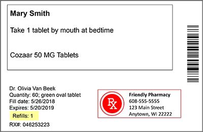
At the top of the label, display the:- patient’s name
- full drug name and strength
- “sig” or directions for use
This means moving the pharmacy logo to the bottom of the label!
- Write directions for use, or “sig,” that are easy for patients to understand:
- Use the Universal Medication Schedule (UMS), a standard time frame for when a patient takes medicine. Say “morning,” “noon,” “evening” or “bedtime” instead of general phrases like “twice daily.”
Example: Write, “Take 2 tablets in the morning and 2 tablets in the evening,” not “Take 2 tablets twice daily.”
- Use sentence case instead of ALL CAPS.
- Use numbers instead of alphabetic characters.
Example: write, “Take 2 tablets,” not “Take two tablets.”
- Use the Universal Medication Schedule (UMS), a standard time frame for when a patient takes medicine. Say “morning,” “noon,” “evening” or “bedtime” instead of general phrases like “twice daily.”
- Use simple language. Avoid jargon.
Example: write, “High blood pressure,” not “Hypertension.”
- Include purpose for use: if the prescriber includes the reason the patient is to take the medicine, it should be included on the label unless the patient does not want it there. Some patients may want this kept private.
- Again – avoid jargon!
- Again – avoid jargon!
- Improve readability – design your labels so they are easier to read.
Here are some tips:- Leave enough white space
- Use dark letters on lighter background
- Use large, clean fonts (Times New Roman-minimum 12-point; or Arial- minimum 11 point)
- Highlight or bold patient-centered information or information that facilitates adherence (i.e.; Refill ordering)
- Address limited English proficiency:
- When possible, write the directions for use in the patient’s preferred language.
- But: Keep the drug name in English, so emergency workers can quickly access the information.
- But: Keep the drug name in English, so emergency workers can quickly access the information.
- Use a high-quality translation process.
- When possible, write the directions for use in the patient’s preferred language.
- Address visual impairment: helping visually impaired patients understand how to safely and effectively take their medication is very important.
Follow these tips:- Find alternative access methods such as: tactile (touch), auditory (hearing), or enhanced visual systems.
- Enhance communications with your visually impaired patients. Together you could identify the best method(s) to help.
- Limit auxiliary information: most patients do not pay attention to these.
If using auxiliary information:- include simple language that is evidenced-based.
- include information that patients need to safely use their medicine.
- do not include icons unless they have been consumer-tested to ensure patient understanding. (Icons can be very confusing to patients.)
We hope this information has helped you!
Wisconsin pharmacies that are interested in joining our project to revise labels can email Kari LaScala at: kari@wisconsinliteracy.org. But hurry – the project will likely end in the late spring of 2021!
For more information, please visit: bit.ly/EasyToReadLabels